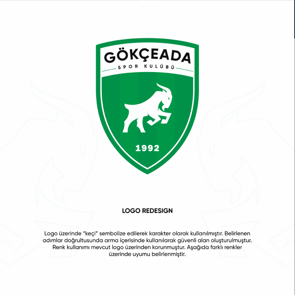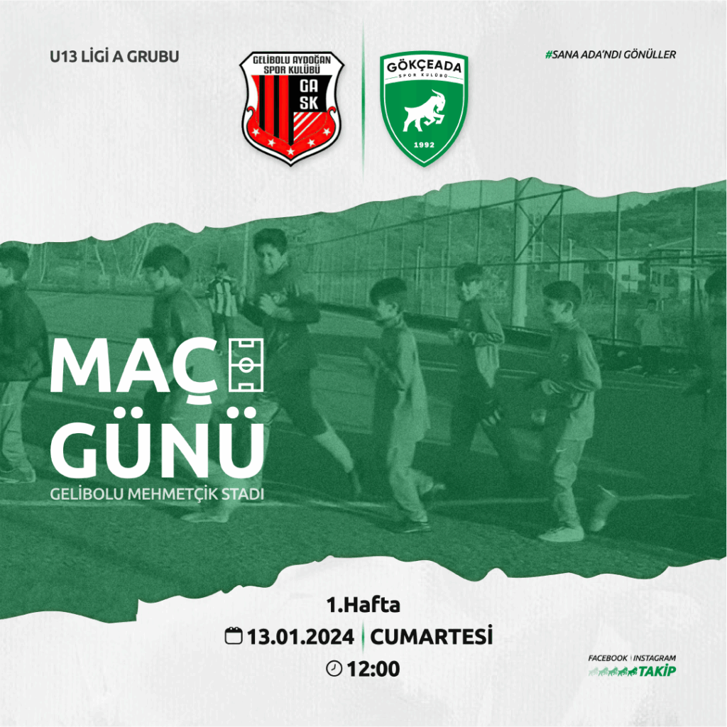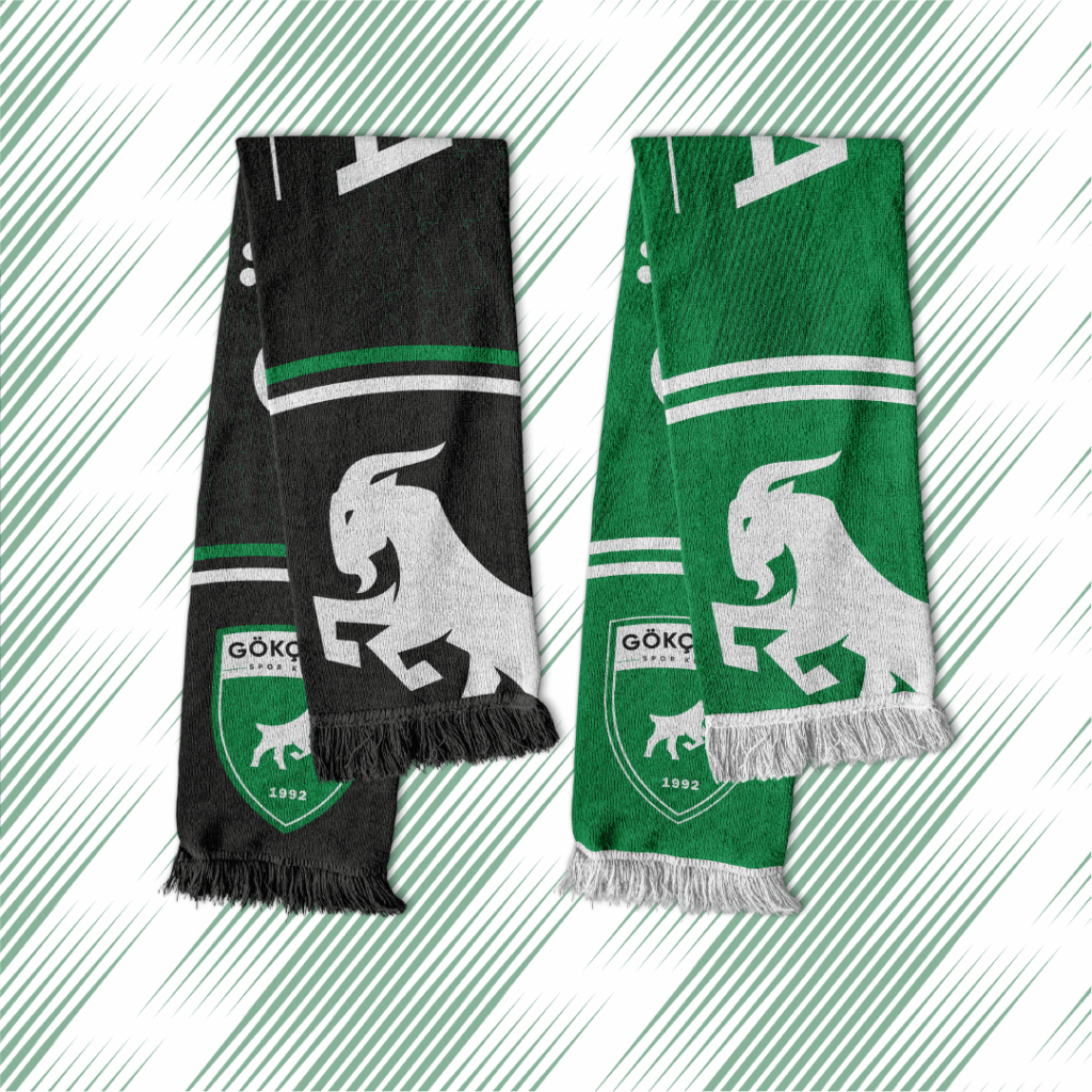
The new corporate identity of Gökçeada Sports Club has been redesigned with a modern approach that reflects the culture and spirit of the island. In the logo design, the goat figüre one of the natural symbols of Gökçeada has been portrayed with a strong, dynamic, and determined stance, representing the club’s fighting spirit, resilience, and forward-looking vision.
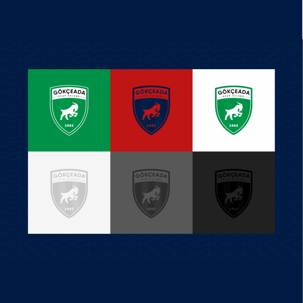
The forms and lines used in the new logo emphasize the dynamism of sports and the deep-rooted structure of the club. The sharp edges of the emblem symbolize strength and determination, while the inner figure directly connects with the island’s geography and historical identity. In terms of color, the club’s traditional values have been preserved, yet the tones have been refined for a stronger and more corporate appearance. In this way, a modern design language has been established, reflecting both the nature and spirit of Gökçeada.
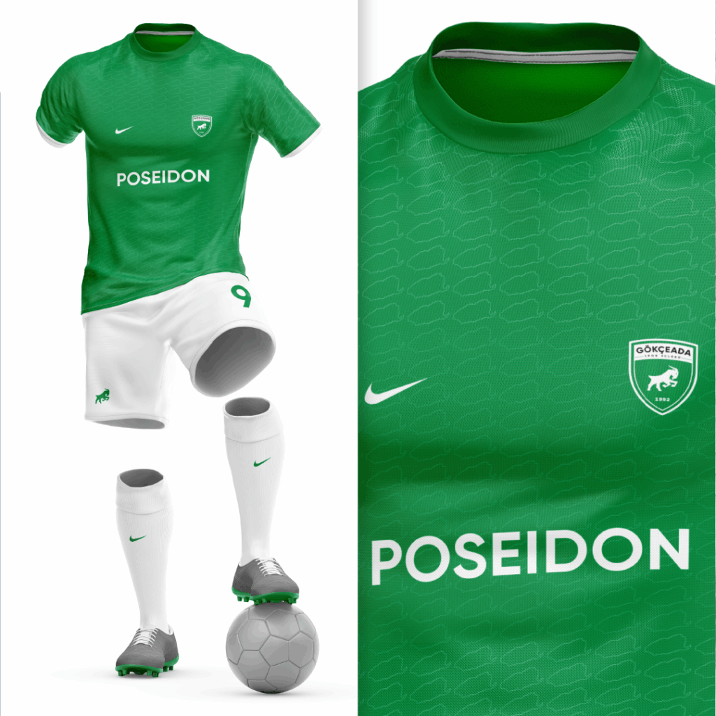
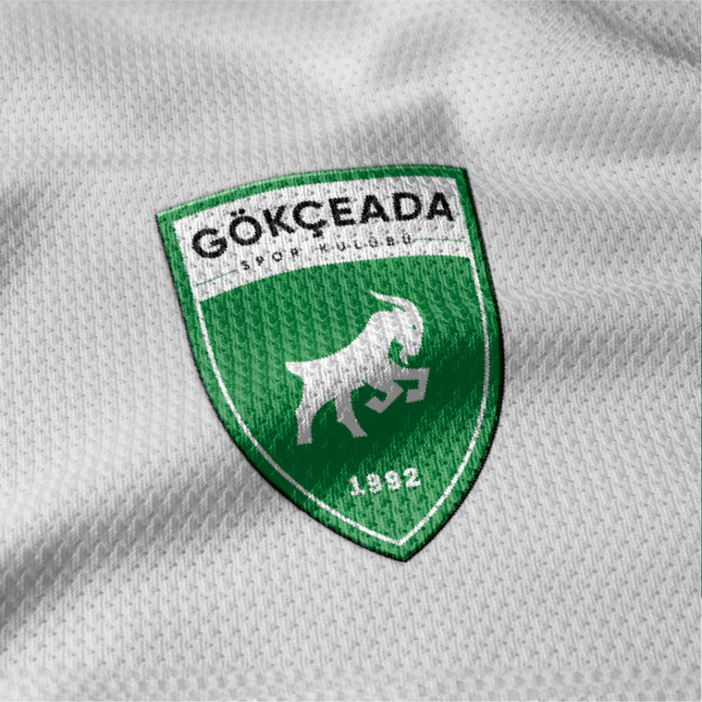
The new identity work has not been limited to the logo alone; a holistic design approach has also been adopted for jerseys, shorts, socks, scarves, and flag prints. Every detail has been carefully designed to support corporate integrity, aiming for an aesthetically balanced and modern look. The club’s presence on the field now stands out not only with its performance but also with its professional visual identity.